
App Store screenshot examples and patterns for iOS apps.
Strong App Store screenshot sets are not a collection of nice images — they are a sequence that makes an argument. The pattern you choose determines what the first screenshot has to do and what order the rest follow.
Below are the set structures that show up repeatedly in listings that convert well, when each one fits, and the ordering and caption decisions that matter more than the visual style.
Pattern 1: benefit-led
Each screenshot leads with an outcome the user cares about, with the UI as supporting evidence. This is the default choice for most utility, productivity, and subscription apps because it answers the user's actual question — what do I get?
- Screen 1: the single strongest outcome, stated plainly.
- Screen 2: the second-strongest outcome, ideally a different kind of benefit.
- Screen 3: proof that the outcome is real — a result, a number, a finished state.
- Screens 4 to 6: supporting capabilities in descending order of importance.
Works best when the app's value is not obvious from its interface alone.
Pattern 2: feature-led
The set walks through the product's main surfaces in the order a user would meet them. This suits apps whose value is self-evident and whose main risk is looking too simple rather than too complex.
- Screen 1: the primary surface, showing the app in its most recognisable state.
- Screen 2: the core workflow or dashboard.
- Screen 3: the strongest differentiating feature.
- Screens 4 to 6: secondary features, settings, or integrations.
The failure mode is a feature tour that never says why any of it matters.
Pattern 3: problem-then-solution
The first screenshot names a frustration the user recognises, and the rest resolve it. High risk, high reward: it earns attention when the problem lands and loses the user immediately when it does not.
- Screen 1: the problem, stated in the user's own words.
- Screen 2: the app's answer to it.
- Screen 3: the outcome after the problem is solved.
- Screens 4 to 6: how it works, and what else it handles.
Pattern 4: localized set
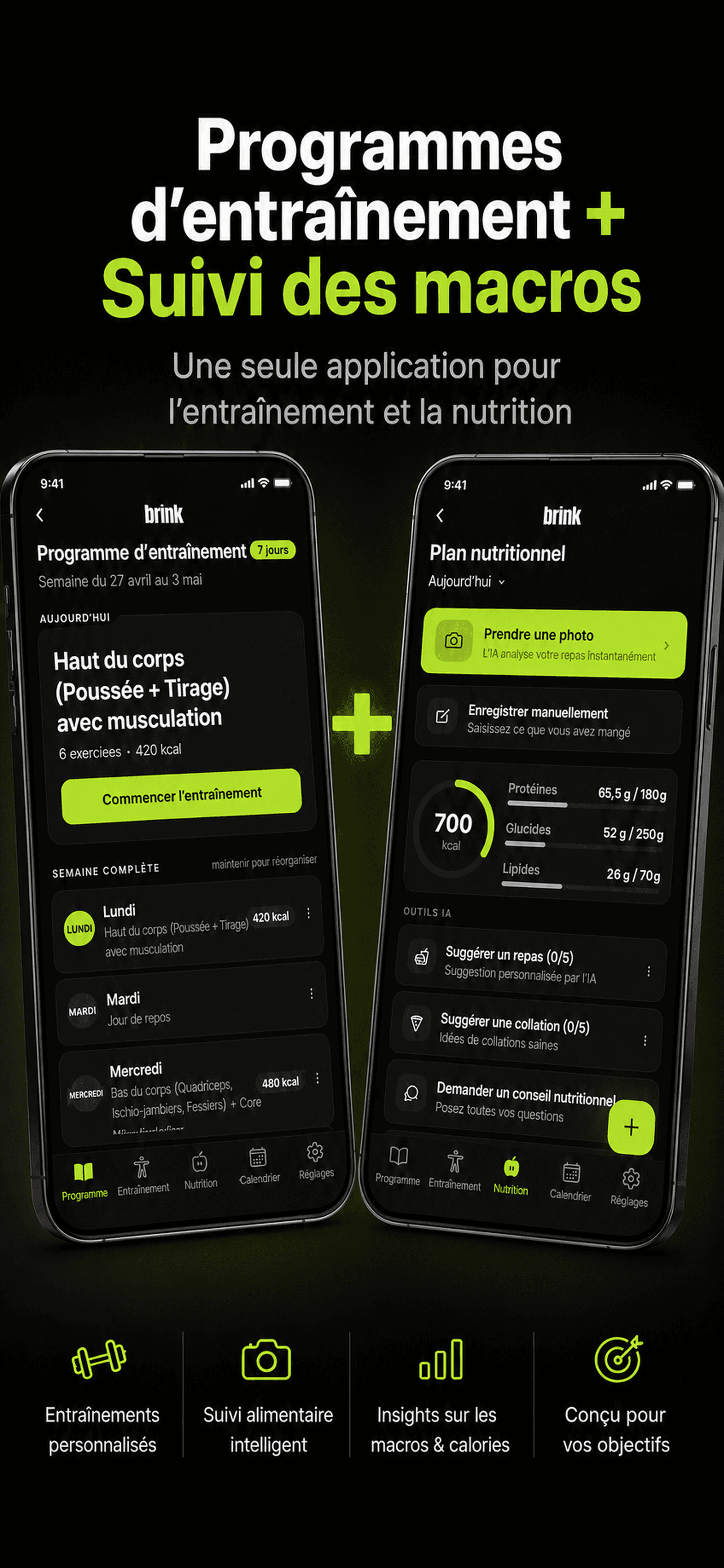
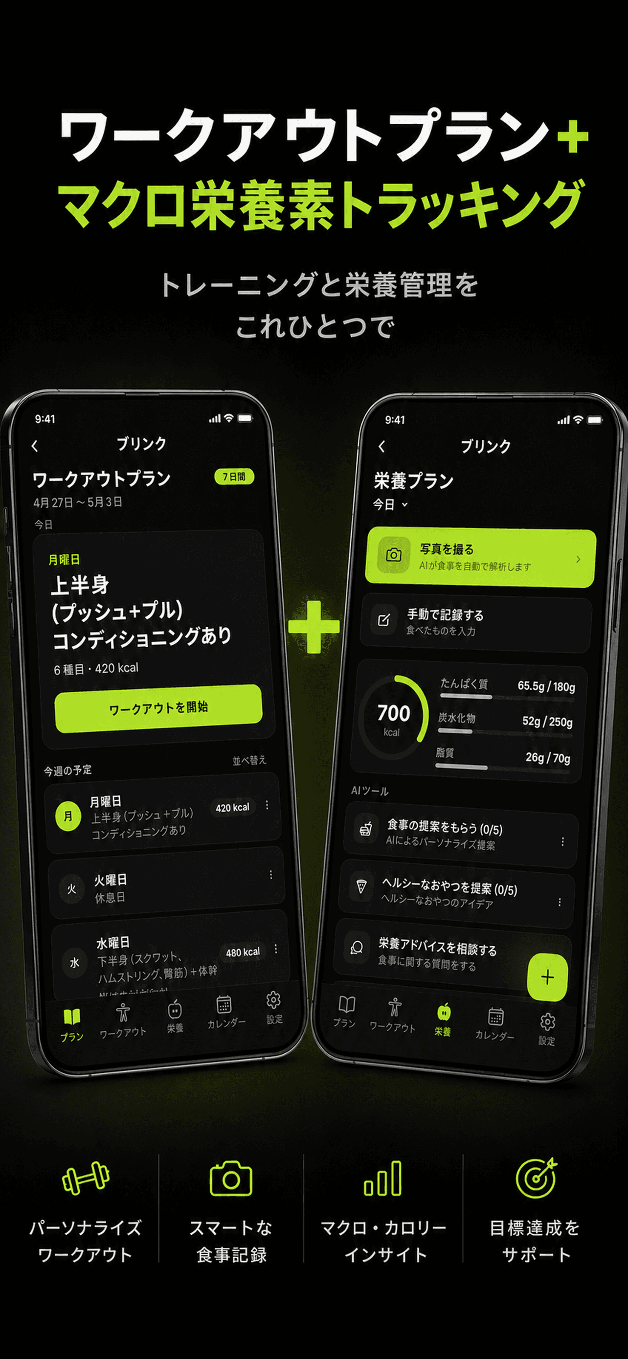
Structurally the same as whichever pattern you chose, generated per market. The visual direction stays fixed so the listing looks like one product; only the copy changes.
- Keep feature order identical across locales for consistency.
- Let copy length differ — do not force translations into the English layout.
- Check the first two screenshots hardest in every market.
Ordering matters more than styling
Most teams spend their effort on visual polish and almost none on sequence, which is backwards. Viewership drops sharply after the third screenshot, so the ordering decision is where the leverage is.
- Screenshot 1 appears in search results — treat it as the whole pitch.
- Do not save the best feature for screenshot 6; almost nobody gets there.
- Avoid front-loading onboarding or login screens.
- Each screenshot should make sense alone, since users may land mid-set.
Caption rules that hold up
Screenshot captions are read as thumbnails on a phone, not as full-size images on a desktop. That constraint drives every good caption decision.
- Keep headlines under about six words.
- Write in the user's language, not internal feature names.
- Use sentence case; all-caps is harder to read at small sizes.
- Ensure contrast survives compression and a small display.
- Never rely on text inside the UI screenshot itself being legible.
Example generated screenshot sets
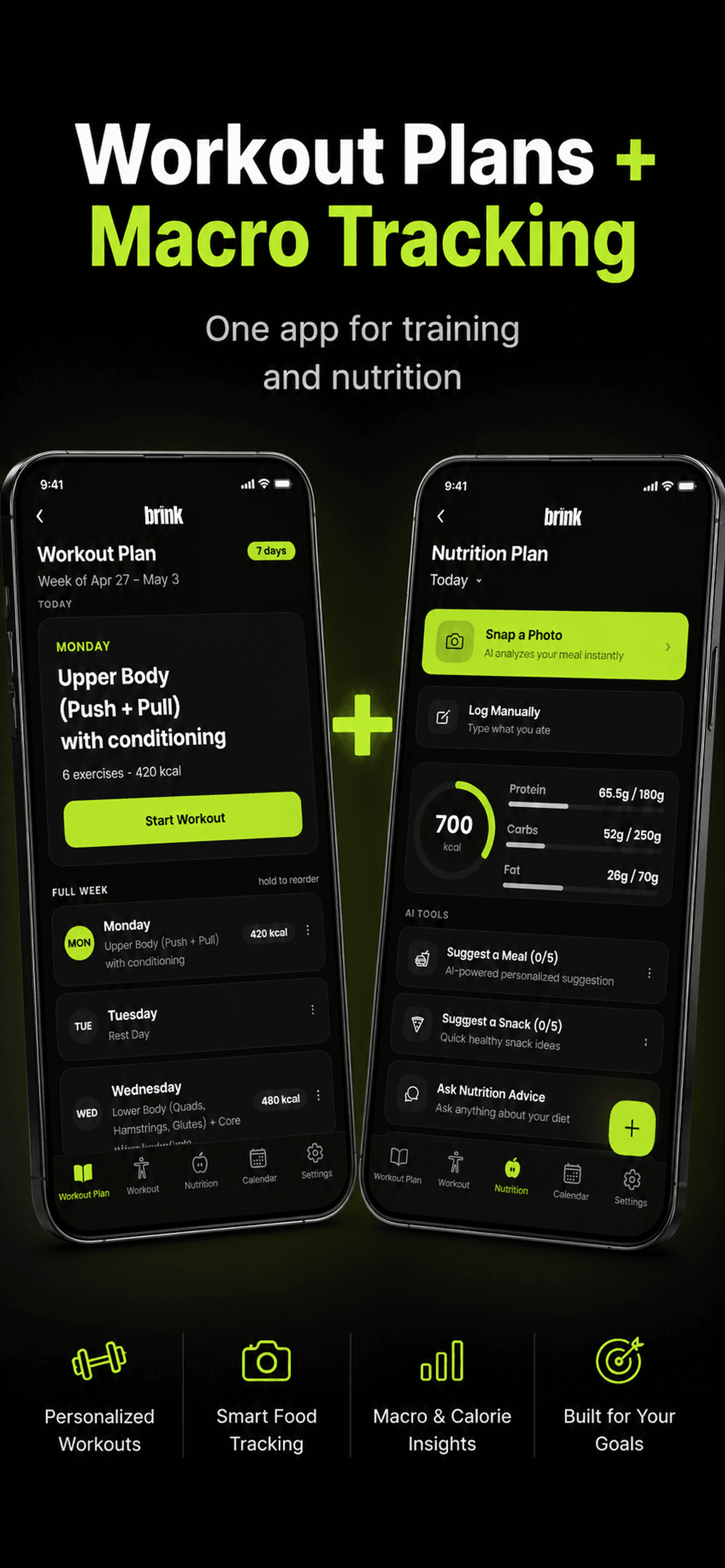
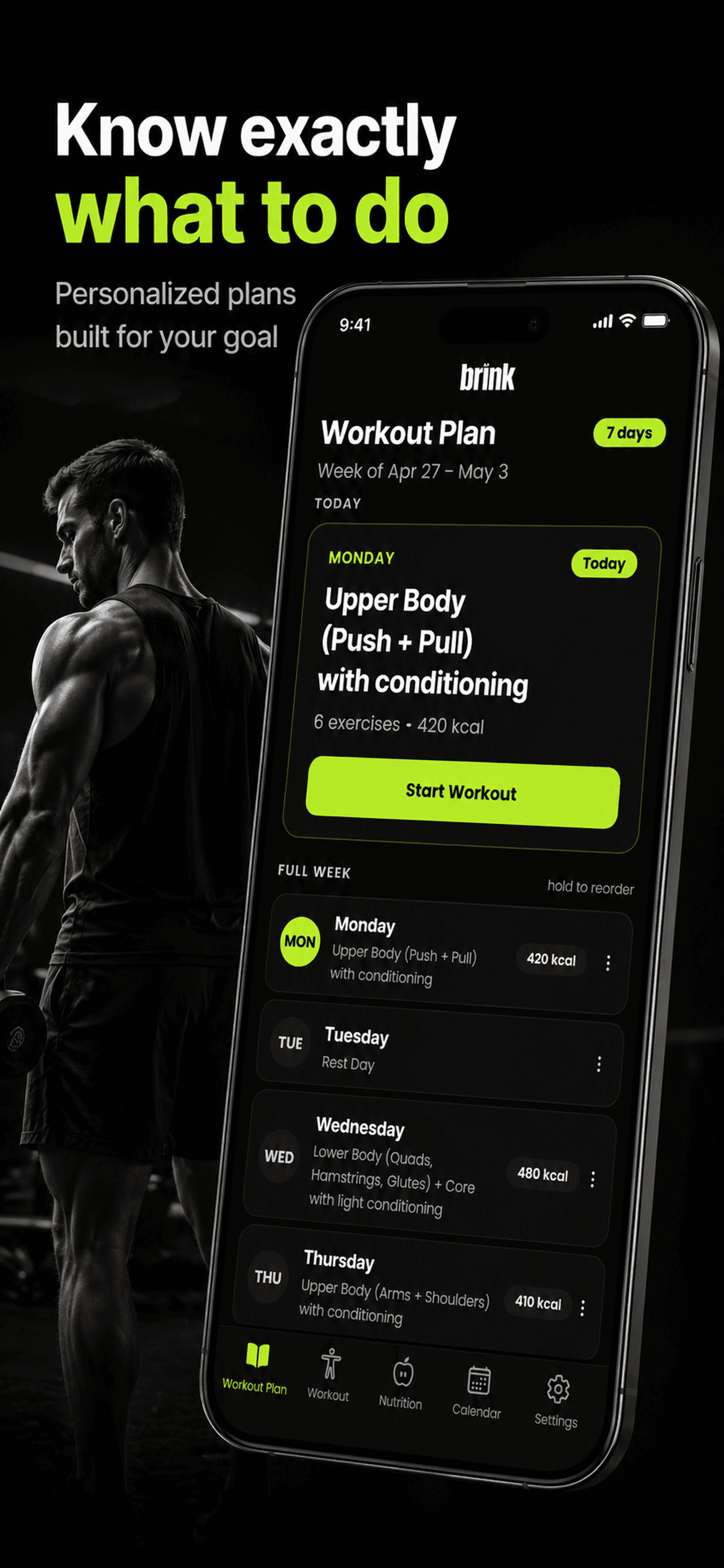
A single approved direction generated across four locales. Note that the layout, colour treatment, and feature order stay constant while the copy changes per market.
Frequently asked questions
- How many screenshots should an App Store listing have?
- Apple allows up to ten per display class, and most strong listings use between five and eight. Fewer than four tends to leave the product under-explained; more than eight rarely gets viewed, since the drop-off after the third screenshot is steep.
- Which screenshot matters most?
- The first, by a wide margin. It is the one shown in search results alongside your icon, and it is often the only one a user sees before deciding. The second and third carry most of the remaining weight.
- Should screenshots have text captions?
- Almost always yes. A bare UI screenshot asks the user to work out what the app does; a captioned one tells them. The exception is apps whose value is immediately visual, such as photo editors or games, where the image itself makes the argument.
- Should I use device frames?
- Device frames add polish and make it obvious the image is an app, but they also shrink the usable area for your UI and copy. Framed layouts work well for utility and productivity apps; full-bleed layouts work better for games and media apps where immersion matters more.
- Do portrait or landscape screenshots work better?
- Portrait for almost all iPhone apps, because it matches how the App Store displays them and how the app is actually used. Landscape makes sense mainly for games and video apps that are used in that orientation.
Generate a set in one of these patterns
Pick a direction, generate a full set from your own app screens, and review the sequence before it reaches your listing.
Related guides
How the generator turns raw app screens into finished App Store screenshot sets.
Why localized screenshot sets matter and how the 42-locale workflow runs.
Every iPhone and iPad screenshot dimension, file type, and count limit.
What to compare when choosing an App Store screenshot tool.